The Secrets of Hillsong

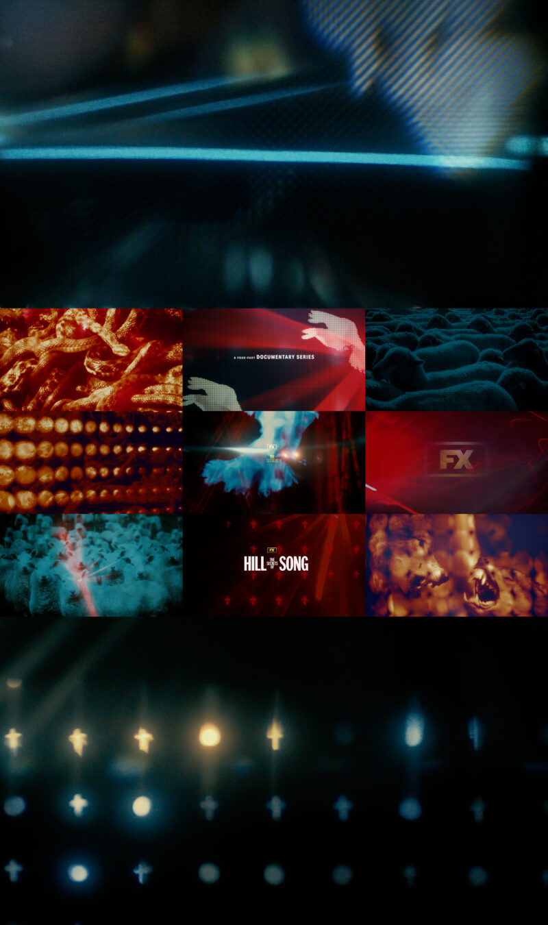
The FX documentary series, The Secrets of Hillsong explores the scandals and criticisms of an American clout-priest and the Australian group’s religious founders he aligned with.

Our motivation for the concept and design of the episodic package came from the language of these franchised hype-churches, these digital revival tents. Where in the past spitting preachers were enough, now lights, lasers, LED panels and screens command the congregations.

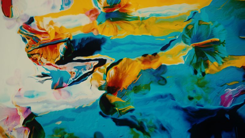
We created a package primarily using in-camera, photographic effects. Real lasers, real smoke, real LED effects, real aberrations of light and lenses were captured and sequenced to deliver a predator and prey narrative, all in keeping with Sunday school traditions. Custom cut screens were intricately built to allow for novel transitions between cruciforms and live action plates. These screens echo the massive electronic onstage LED panels used by these church groups and also the low tech dividers of traditional church confessional booths. Further manipulations were performed with motorized acrylic and glass lens elements between live action plates and high output light setups. As the series exposes the charlatans as constructions, so too does this majority analog package we assembled for FX.

“You know there’s a lot of people wanting someone, to tell them what to do.”

Link to more stills, etc.

The Choe Show

In the FX series The Choe Show, artist David Choe interviews and explores relationships via paint and patter, finishing with portraits of guests rendered at the end of each exchange. Last Spring, tasked with reflecting the feel of the FX series, we put together a few different concepts for effective episodic packages that touched directly on details that we found significant after an early preview of the episodes.

Combining live-action angles of thick, heavy body paints with multi-plane arrayed flower and live-action plant details, we crafted an ever changing, ever shifting reflection of the series’ tone. Thick peaks of saturated paint meld with flower accents. Two-dimensional surfaces transition to three-dimensions while petals, pistils, and stamens erupt from rippling colors. In addition, we handcrafted analog type elements and alphabets to complete the package.

As a new and novel type of series, our intent, like all our projects, was to deliver unique visuals to communicate the program’s singular tone. We were happy to work together with the talented team at FX to follow through successfully on that intention.

Link to Stills and Credits

A Wilderness of Error

The five-part FX documentary series A Wilderness of Error plays like a meta retelling of multiple accounts of the same story through multiple lenses. The initial account of a gruesome crime is questioned. That questioning is questioned. And, yes, that questioning is itself questioned. Phew.

Tasked with developing a creative take for an episodic package, we focused on this repeated digestion of the story and errors entailed within. We took a literal approach and exploited actual ‘errors’ in a technique wherein each frame is informed by the preceding image. Visual errors get amplified, much like the investigators, writers, and filmmakers have amplified over the years.

Link to Stills and Credits

The Most Dangerous Animal of All

Beneath the outward facade of some families lay dark secrets. Gary Stewart’s family may have one of the darkest. Earlier this year we were kindly asked and tasked by folks at FX with reinterpreting the trope filled landscape of true crime series graphics for The Most Dangerous Animal of All. This four-part documentary based on Stewart’s best selling book of the same name focuses on the story of a man discovering the potential reality his own father was the notorious Zodiac killer.

We produced an episodic package composed of original photography and hand drawn ciphers, further manipulated with rips, tears, and abrasions to reinforce the menacing tone of the series.

Fortunately, for this project, the Impactist image archive was available to supply the needed textures and analog photography we would use to complete the package. Opportunities like this also reinforce what we feel is a good habit: to be continually making images and cataloging them for future needs.

Links to Stills and Credits.

You’re the Worst – Season 5

The fifth and final season of You’re the Worst on FXX follows the two narcissistic self-destructive leads, Jimmy and Gretchen, approach towards their impending marriage.

For the episodic package and promos, we spent a couple days shooting thousands of sequential stills on location in Los Angeles throughout the YTW universe. In a broken editorial style we combined the loose photographic compositions of Silver Lake, cast imagery, anonymous wedding moments and letter boards common to the entrance of countless conference rooms, banquet halls, and other rental spaces when converted to wedding reception locations. Additionally, an original typeface was created to match the photographed letter boards and included in the final client toolkit deliverables for later updating of program details.

The reliably blue skied and sun-kissed LA weather let us make time efficient use of our glimmer-glassed, pro-misted, vintage lensed, and color balanced Canon bodies paired with a custom LUT created pre-shoot to unify the color of the final package. We even found ourselves briefly camping inside Ye Rustic Inn to backup flash cards to the cloud, but without getting blacklisted like Gretchen.

Beyond neighborhood specific street photography, further photographic elements like pattern details and obvious, high concept LA scenes of highway traffic, towering palms, distant skylines, etc. were captured and intercut for context.

Link to Stills and Credits.

You’re the Worst

For the fourth season of You’re the Worst, we worked with our friends at FX on this package filled with lip bites, eye roll snark, and detached cool.

We were fortunate to snag some time with the FX crew for a quick live action shoot with Chris & Aya to intercut with stylized still photography. Live action mixes with hand crafted type, bound by rhythmic tiling grids in pieces built to surround and support the broadcast series.

We might all be the worst, but hopefully we’re somebody’s worst.

Link to Stills and Credits.