Tag: color
Pigments
_
Making a Case for Mobile Color
Okay, so of course no case need be made. That just sounded like a good title for this entry instead of ‘Color Loving on Your iPod’. Now, this isn’t meant to be an endorsement for iPods, iPhones, or any Apple handheld, but rather any device that has software allowing for quick mark making and color picking.
It’s one thing to talk color with a client or co-worker and clearly something else to actively collaborate with one another while using an interactive application that both parties can simultaneously view, manipulate, and have present with them so long as they have a charged battery. Enter the mobile device sketch app. Brushes, Sketchbook, Layers… It doesn’t really matter which one so long as you have a color picker and a blank canvas to make marks. This color picking ability gives value to possessing this type of software on your mobile device even if you have no intention to draw or paint on the screen. It’s really just a quick and convenient color palette to have on you at all times that lets you show color with color rather than abstractly describe color with words alone.
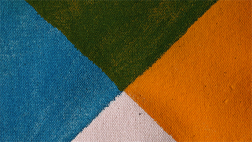
Orange and blue to one person may translate as salmon and turquoise in another person’s mental color palette. Nobody wants confusion on these most basic and important of design decisions and this is just one more way to avoid that. Don’t bother with Pantone chips if you don’t have to. You can always match later. And what’s that you say about the Pantone app? Well, in all honesty it’s fairly useless since the screen on an iPod/iPhone is so inconsistent with it shifting wildly red from one side and blue from the other that number matching may be just downright pointless with the current screens.
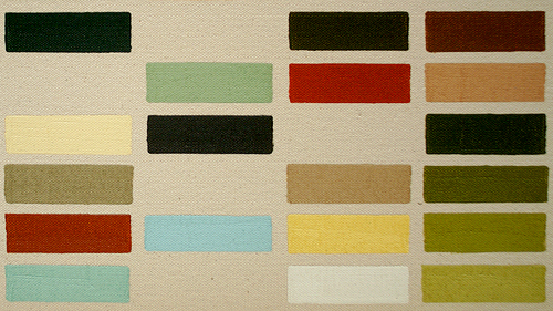
Ever hear somebody explain their uncertainty or inability to make a critical design decision by stating that they are a ‘visual person’? And, did it end up that they weren’t a visual person at all, since a visual person would be able to actually visualize using their mind’s eye rather than you laboring to provide them with twenty color swatches, endless comps, countless styleframes, and near completed designs? That’s where this mobile color picking idea comes in to provide relief from and to give you a bit more control over preliminary design decisions specifically involving color, but without the hassle of lugging pantone color chips, wasting time sourcing online imagery, or even busting out the ol’ marker bin to find the correct color and value.
Pick a color under consideration, make a mark, select another color and value, and juxtapose against the previous. Success? No? Try again. Pass it to your client. Let them explain themselves more clearly and directly on the screen, which will in the end help you help them. Too easy and convenient. It’s already in your pocket or bag, right next to your notes during your pre-pro meeting in conference room C. Oh snap, just saved you a day’s worth of reviews right there since your number one client really wanted dull yellows and greens rather than what they had initially told you and outlined on their boards.
In the end, it’s just a handy alternate use of something you may already possess, but might not be taking full advantage of. We thought it worth considering.
Here’s to color mixing and better color communications!
_

_