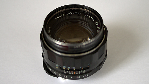
What Is the Line and How to Cross It


Over and over, you see it happen online. But, to be specific about what it is and where it stands is the conundrum. It’s that invisible line that people on message boards and blog comment strings seem to gingerly step just along side and rarely cross over. Especially in creative and design related discussions about business practices, you see people skillfully balance upon the edge while a crowd forms below to taunt the potential jumper with questions and comments like:

“Name the studio that didn’t pay!”
“What’s a fair day rate for Anytown, USA?”
“Did you just regurgitate back the agency boards?”
“Did you compensate the originator of the technique or just rip it?”

The crowd chants, but instead of the individual pushing away and into the ether with full disclosure, they turn back unable to take the leap into honesty and transparency.

It’s a funny contradiction. So often, people call out for fairness and respect on behalf of the artists and creators of content when situations arise where they’ve been dealt with unethically, unprofessionally, or even illegally. They act as if to be a modern day Norma Rae. But, as soon as names are cited, requested, or specifics to an issue are exposed that allows the anonymous audience to fully understand all parties involved in a particular case of claimed wrong doing, a foul is called and the brave individual is chided and derided for telling the truth bravely. The same truth that prior consensus had established was far too rare and should be sought out and championed for the good of the group. They speak strongly, but won’t shut off the loom and stand up on the table.

It’s a strange balance of open sharing and honesty against concealment and hypocrisy. One day, a call will sound for artists to band together against spec projects and contests in an effort to try to regain a perceived loss of value for our work… The next? A spec project is championed without a word of criticism. Similarly, hopes for better work relationships between contractor and the contracted are discussed, but mentioned specifics like what facilities or which individuals to avoid are frowned upon when it’s these very details that hold importance.

Everybody wants to race up to the line and shout out with full lungs. Yet, when only inches away, we cower and sulk while watering down our concerns and reduce their importance and value to the anonymous audience we are speaking with.

What is this line? Is there a name or a way to address it? Or is it as simple as calling it fear or lack of courage? With all this anonymity, you’d think the free exchange of ideas and information would be hard to hold back. But, instead it remains impotent. There, but ineffectual.

Amazing how much tiptoeing we all do, when in reality the amount of real help and valuable information we could all share is enormous if only we could get over ourselves and remove these imagined bonds. This could go on and on, but as we’re not too particularly fond of rants ourselves… we’ll leave it at that since this probably doesn’t make much sense anyways.

Published
Categorized as Commentary

Making a Case for Mobile Color


Okay, so of course no case need be made. That just sounded like a good title for this entry instead of ‘Color Loving on Your iPod’. Now, this isn’t meant to be an endorsement for iPods, iPhones, or any Apple handheld, but rather any device that has software allowing for quick mark making and color picking.

It’s one thing to talk color with a client or co-worker and clearly something else to actively collaborate with one another while using an interactive application that both parties can simultaneously view, manipulate, and have present with them so long as they have a charged battery. Enter the mobile device sketch app. Brushes, Sketchbook, Layers… It doesn’t really matter which one so long as you have a color picker and a blank canvas to make marks. This color picking ability gives value to possessing this type of software on your mobile device even if you have no intention to draw or paint on the screen. It’s really just a quick and convenient color palette to have on you at all times that lets you show color with color rather than abstractly describe color with words alone.

Orange and blue to one person may translate as salmon and turquoise in another person’s mental color palette. Nobody wants confusion on these most basic and important of design decisions and this is just one more way to avoid that. Don’t bother with Pantone chips if you don’t have to. You can always match later. And what’s that you say about the Pantone app? Well, in all honesty it’s fairly useless since the screen on an iPod/iPhone is so inconsistent with it shifting wildly red from one side and blue from the other that number matching may be just downright pointless with the current screens.

Ever hear somebody explain their uncertainty or inability to make a critical design decision by stating that they are a ‘visual person’? And, did it end up that they weren’t a visual person at all, since a visual person would be able to actually visualize using their mind’s eye rather than you laboring to provide them with twenty color swatches, endless comps, countless styleframes, and near completed designs? That’s where this mobile color picking idea comes in to provide relief from and to give you a bit more control over preliminary design decisions specifically involving color, but without the hassle of lugging pantone color chips, wasting time sourcing online imagery, or even busting out the ol’ marker bin to find the correct color and value.

Pick a color under consideration, make a mark, select another color and value, and juxtapose against the previous. Success? No? Try again. Pass it to your client. Let them explain themselves more clearly and directly on the screen, which will in the end help you help them. Too easy and convenient. It’s already in your pocket or bag, right next to your notes during your pre-pro meeting in conference room C. Oh snap, just saved you a day’s worth of reviews right there since your number one client really wanted dull yellows and greens rather than what they had initially told you and outlined on their boards.

In the end, it’s just a handy alternate use of something you may already possess, but might not be taking full advantage of. We thought it worth considering.

Here’s to color mixing and better color communications!